Subsection5.4.1Introduction to the data set and how to work with variables
Motivating Ideas.
In this section I will...
Make inferences about trends based on data and graphs.
Summarize the relationships between variables.
Interpret visualizations (i.e. bar charts) based on legislative data.
A common claim in the news media, and a common feeling among trans and nonbinary folks, is that 2023 is by far the worst recent year for anti-trans legislation. How do we explore if 2023 was the year of anti-trans legislation? This question is vague - what does an answer to this question mean? How do we use this information in our advocacy? In order to conduct research, we need to drill down into more specific questions that can be answered empirically. This is an important story that needs to be documented to mitigate and eventually prevent future cases of hate. We are trying to understand broader patterns to better understand where our advocacy work may make a difference.
The targeting of the transgender community through legislation has been a significant topic in the news in 2023. We could compare the volume of news stories related to anti-trans legislation in 2023 to the volume in previous years. However, does this approach measure what we are looking for? Perhaps the same story is being repeated multiple times?
A better approach is to look at the legislation itself. We can ask a similar question about the legislation. What - if anything - was different about the volume of anti-trans legislation in 2023 from the volume in previous years? This is another question we can investigate with data in order to tell this story.
Let’s take a look at the data we sourced and cleaned in the last section. Note, we include the cleaned version of the data in this section, so if you missed the prior section, or did not finish you can still explore in this section.
Note that crossing over refers to a bill being passed out of one state legislative chamber (either the State House or State Senate) and moving forward for consideration in the other chamber. Thus, a bill that has crossed over suggests majority support for the bill in at least one chamber.
Activity1.
Where did the data come from? Assess the trustworthiness of the data and the sources.
Definition5.4.1.
A variable is, roughly, a column in the dataset.
Activity2.
We described some of the variables that are in this dataset.
What variables would you be interested in that are missing from the data?
What questions do you have about the data set?
Definition5.4.2.
A quantitative variable is a variable that represents something that is inherently numerical (such as the cost of a good or service), and a categorical variable is a variable whose values represent certain categories (such as military ranks).
Activity3.
Which variables in the dataset are quantitative and which are categorical?
Sometimes variable values are directly observable. For example, if we wanted to make a dataset for the price of a specific product at three different stores, we can go to the stores and find those prices. Sometimes variable values are not directly observable. For example, the number of individuals in a location who have committed crimes.
Definition5.4.3.
A proxy variable is a directly observable variable that is used in place of variable that is not directly observable. For example, we may use the number of convicted criminals as a proxy for the number of criminals.
Activity4.
What research questions do you have after exploring the data set?
Subsection5.4.2How to explore the data visually
We often start investigating our questions by exploring and becoming familiar with our data. One of the most powerful ways to explore data (as well as to communicate with data) is through visualization through graphs and charts.
Before proceeding, be sure to run this code cell that reads in the data file.
Activity5.
What are some types of graphs you have seen before? For each, what do you think that type of graph is useful for?
The data set includes the status of each bill. Review the dataset. What are the different statuses?
Let’s generate a graph showing how many bills there are with each status. To generate a graph, replace the [INSERT_GRAPH_TYPE] with one of the following in the code cell below:
A bar graph: geom_bar(stat = "identity")
A histogram: geom_histogram(binwidth = 1)
A boxplot: geom_boxplot()
A line graph: geom_line()
A pie graph: This is the Nickelback of charts (see https://www.businessinsider.com/pie-charts-are-the-worst-2013-6)
A scatterplot: geom_point()
Try to create each type of graph in R. Some will cause errors - that is a sign that this type of graph isn’t appropriate for this question. Which graph do you think is the clearest? Why do you think that is? What do you notice from this graph? Does this tell you anything about our question regarding 2023?
Now let us look at what is happening by year. Run the following code cell to group the data by year.
For the following two pieces of data, generate each type of graph and answer the same questions from above: Which graph do you think is the clearest? Why do you think that is? What do you notice from this graph? Does this tell you anything about our question regarding 2023?
The total number of bills proposed between 2018 and 2023.
The bills signed and enacted between 2018 and 2023.
Activity6.
Let us look back at our work and see if we can draw some conclusions, both about data visualization and about our story regarding anti-trans legislation in 2023.
For each graph you generated, what were the variables involved? Were they quantitative or categorical? Which graphs contribute toward our understanding of our question?
Which types of graphs did you choose? Compare your choices to the variables you compared. What do you notice? Write a guideline to help select one or more graph types based on the data you are examining.
Based on what you found, write one or two sentences summarizing our findings so far regarding anti-trans legislation in 2023.
There is a difference between a count and a proportion. A count value tells you the raw number of times something occurs, whereas a proportion tells you the percentage of the total times something occurs. Whenever dealing with proportions, you have to think carefully about the denominator!
Subsubsection5.4.2.1Two or more variable graphing
Both quantitative and qualitative data can be analyzed under two types, categorical and numerical. Categorical data allows us to organize the data into sections or groupings that have similar characteristics. Numerical data often allows us to draw comparisons between the data and analyze trends, relationships, outliers, and other statistical qualifiers. Within the classification of numerical data, we have more descriptive graphs that can be used (scatter plot, line graph, bar graph, etc.)
Activity7.
Activity Questions:
Often we want to compare one variable against another to see how they might be associated. So it’s worthwhile to imagine how we’d plot two variables on a single graph. Let’s explore some of those graph types here.
A scatterplot: geom_point()
A stacked bar graph: CODEGOESHERE
A stacked bar graph with proportions: CODEGOESHERE
A dodge bar graph: CODEGOESHERE
A dodge bar graph with proportios: CODEGOESHERE
A boxplot: CODEGOESHERE
Try to create each type of graph in R. Some will cause errors - that is a sign that this type of graph isn’t appropriate for this question. Which graph do you think is the clearest? Why do you think that is? What do you notice from this graph? Does this tell you anything about our question regarding 2023? Do these graphs prompt any new questions?
In the above activity we had bar graphs that allows us to compare the numerical data of a particular variable (total number of passed bills from 2018 to 2023) with the total number of introduced bills within this same time period or the total number of bills that crossed over again during the same time period. Using these graphs we can explore a relationship between the proportions of bills which are crossed over or passed within each year as well as the trend over time as to what proportions are crossed over or passed. These bar graphs are sometimes referred to as multigraphs.
In the above activity we created similar graphs by focusing on the frequency or count of a Bill.Type appearing, and then we’d look at the proportion of that Bill.Type compared to the total number of bills during that year. Let’s explore the pros and cons of representing data in these two methods.
Try to create each type of graph in R. Some will cause errors - that is a sign that this type of graph isn’t appropriate for this question. Which graph do you think is the clearest? Why do you think that is? What do you notice from this graph? Does this tell you anything about our question regarding 2023?
Activity8.
Can you see how this data can also be described by using a line graph? Are there any advantages or disadvantages of using one over the other?
What story is each of these graphs telling? How do they differ? How are they similar.
Activity9.
In the code below, you can change the variables by replacing "INSERT_Variable" with your variable that you want to explore.
Consider the total number of bills passed from 2018 to 2022 and the total number of bills passed in 2023.
Which of these two graphs tells a more compelling story?
List your thoughts on how the same data presented in two different ways can seem to show different results.
Subsection5.4.3How do we tell a story with the data: answering how is 2023 different from other years
We began this chapter with the question of how 2023 is different from other years in regards to anti-trans legislation. Section 2 introduced us to different visualizations that can help us explore this and evaluate this question.
Figure NUM is a line graph that plots raw numbers of bills introduced in each year from 2018-2023. We can see that the number of bills is increasing each year, but the numbers increased more quickly in 2021 and 2023 than in other years.
Activity10.
What feature of the line graph demonstrates this increase?
We might want to know what prompted these increases to happen, and knowing which types of bills were being proposed during those years might provide insight. Below is a line graph showing just one type of bill. By changing VARIABLE to other types (list), you can generate different graphs.
Activity11.
Which types of bills are increasing in prevalence? Which are decreasing?
What type(s) of bills drove the large increase in 2021? What types of bills drove the large increase in 2023?
Activity12.
Our analysis has so far been focused on bills that were introduced.
What do we learn from analyzing bills that have been introduced?
What do we learn from analyzing bills that have been passed?
Do we need to analyze both–do these different questions tell us different things?
Remark5.4.4.
Tell students how to re-run previous analyses for *passed* bills rather than *introduced* bills.
Our previous visualizations showed that 2023 did have a significant increase in the number of anti-trans bills that were both introduced and passed. In addition to the absolute frequency counts of bills that have passed, we might also be interested in the relative proportion of bills that have been passed–that is, are legislators who are targeting trans people becoming more successful in their efforts?
SOME KIND OF VISUALIZATION OF "SUCCESS" RATE OVER TIME GOES HERE
SUMMARIZE THE STORY HERE
What total number of anti-trans bills were proposed each year from 2018 to 2023?
What total number of anti-trans bills were passed each of these years?
What types of anti-trans bills were proposed more often in 2023 than in previous years?
What types of anti-trans bills were passed more often in 2023?
Activity13.
The data in 2023 stops in April 2023, does this impact our ability to answer any of these questions? How does it impact our ability to answer our questions?
In 2023, since the session is not over in many states, we run the analysis in two ways: including both bills that crossed over and bills that were signed/enacted, and only considering bills which were signed/enacted. What are the pros and cons of each of these decisions in studying the data?
What observations did you make about how many anti-trans bills pass than all previous years since 2018 combined (again, recall that the 2023 data in this analysis only goes through April 21, 2023).
Given our questions this means the variables and levels were are interested in are the bills passed, crossed over (hence passed by at least one chamber of the legislature and not yet dead), and/or signed and enacted between 2021 and 2023, as well as in each year and in the years preceding 2023.
As you explored in the activity part 1, these bills only go through April 21, 2023. To emphasize the change in the number of bills that have a chance of passing or have already been passed over time, we combine all the years 2017-2022 and compare them to 2023.
Our first visualizations give information about the count of these bills, but let us talk about the likelihood of any particular anti-trans bill to pass in 2023 compared to previous years. We saw in graph blah that there appears to be a slight increase in the proportion of bills of all types that passed in 2023 compared to 2018-22.
This final image doesn’t demonstrate an obvious finding, but does motivate another question. Is the difference we are seeing between the two groups significant? What can we infer if we had more refined tools like statistical tests (chi squared, ANOVA, prop test, etc). Or we can refine our questions further, for example, what changes in voter districts, voter laws, or state congress and senate makeup has changed from 2022 to 2023?
Activity14.
stuffstuff
Tell a story about the data What information contributes to answering our research question? What information does not? What limitations are there when working with this data?
Activity15.
In section 1, you wrote ideas about research questions you wanted to explore given this data set. Using the tools we have learned in this section, which questions do you think could be explored and potentially answered? Why you think so? Which graphs would you utilize to explore the data?
Subsection5.4.4Exercises
Checkpoint5.4.5.
In Section 2, you learned how to read visualizations and how to modify code to create them. Using a question from exercise 1, create graphs that you feel would best help you answer your question. Explain what each graph represents, and what you are noticing in those graphs.
Checkpoint5.4.6.
In Section 3, we learned how to synthesize exploratory data visualizations and tell a story with our data. Based on the graphs you created in the prior exercise, tell a story with your data. What actions do you want your data to lead to and how are you using the data to tell that story?
Checkpoint5.4.7.
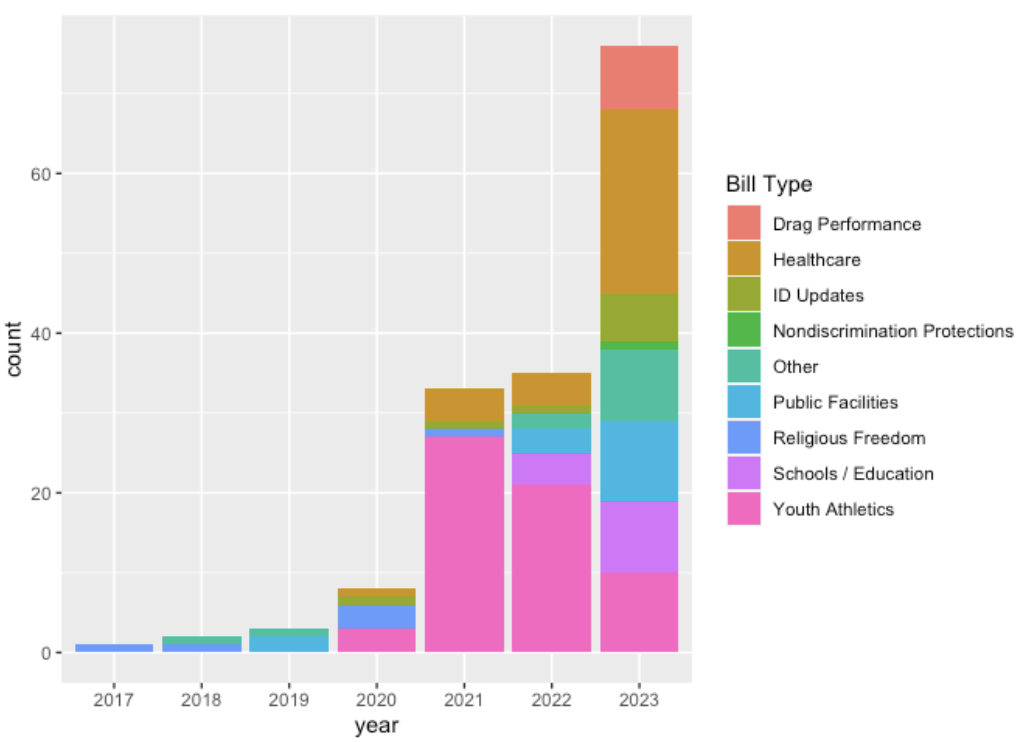
Now, let’s put everything together and refer to the following figure and answer the following questions.
What is the name of this type of visualization?
In the year 2023, what bill type is most common?
During which year were the most Youth Athletics bills passed?
About how many bills were passed in the year 2021?
What is an alternative way to visualize this set of data?
If you grouped by “Bill Type,” how many tick marks would be on the x-axis?
For more information on creating grouped and stacked bar plots in R, check out the tutorials in R Graph Gallery 114 .
Subsection5.4.5OLD STUFF BELOW THIS LINE!!!!!!
Preview Activity16.
Sample preview activity
We now summarize the relationships of the type of bill to its status to determine whether specific types of bills were more likely to succeed.
Note that crossing over refers to a bill being passed out of one state legislative chamber (either the State House or State Senate) and moving forward for consideration in the other chamber. Thus, a bill that has crossed over suggests majority support for the bill in at least one chamber.
After loading a data file, it is good practice to look at the first few rows to make sure everything looks reasonable, and to get an idea for what data is present.
It seems like bills related to “ID updates” (i.e., preventing trans and nonbinary people from having their IDs show their correct gender identity), “public facilities” (often preventing trans people from using the bathroom that fits their gender identity), and “youth athletics” (i.e., preventing trans girls from competing on girls’ sports teams) are most likely to be signed by their state’s governor and enacted into law (after passing both legislative chambers).
However, of all the bills that were signed and enacted, most of them by far were related to youth athletics (over double the number of bills from any other category), followed by healthcare, suggesting that more bills were proposed in those categories.
We seek to represent this data in a side-by-side bar chart. In order to provide a more digestible, big-picture viewpoint, we classify the bills by the type of gender-affirming care that is targeted: social transition (excluding artistic performance, which Track Trans Legislation categorizes under Drag Performance), healthcare/medical transition, drag performances (noting that performing in drag and being transgender are distinct, though sometimes overlapping, categories), and Other.
In order to better see proportions, we also show a stacked bar chart that scales every x-axis group to 100%:
Subsubsection5.4.5.1Did the type of bill impact its likelihood of being passed and/or signed?
However, the observed trends could simply relate to the fact that the largest numbers of bills nationwide were proposed in those categories.
In order to simplify the following charts and analysis, we combine certain bill statuses into categories: bills that have crossed over, passed, or were signed and enacted have a significant chance of impacting the lives of trans and nonbinary people in that state, while bills that were vetoed, died, or failed have no chance of impacting lives. Bills listed simply as “introduced” may or may not have the support to eventually pass, but since they are not currently impacting the ability of trans/nonbinary people to access healthcare, play sports, etc., we count them as “Not Passed”.
Now, we want to see a breakdown of the number and percentages of each type of bill that did and didn’t pass.
##  Bill Type Not Passed Passed Total
##       Drag         30      8    38
##    Medical        197     32   229
##      Other         65     13    78
##     Social        443    105   548
##      Total        735    158   893

##  Bill Type Not Passed Passed
##       Drag      78.9%  21.1%
##    Medical      86.0%  14.0%
##      Other      83.3%  16.7%
##     Social      80.8%  19.2%
##      Total      82.3%  17.7%
We wish to plot the number and proportion of each type of bill that was passed.
Figure5.4.8.
Figure5.4.9.
From this chart, it appears that bills restricting hormone therapy, puberty blockers, and other medical interventions are actually somewhat less likely to pass than other types of bills, and that while the number of anti-drag bills is substantially smaller than the number of other types of bills, they are somewhat more likely to pass.
Importantly, fewer than 25% of any type of bill since 2018 has passed. What happens when we break down the bills by year?
Subsection5.4.6Is 2023 the Year of Transphobia?
A common claim in the news media, and a common feeling among trans and nonbinary folks, is that 2023 is by far the worst recent year for anti-trans legislation. Let’s investigate the following questions:
What total number of anti-trans bills were proposed each year from 2018 to 2023?
What total number of anti-trans bills were passed each of these years? In 2023, since the session is not over in many states, we run the analysis in two ways: including both bills that crossed over and bills that were signed/enacted, and only considering bills which were signed/enacted.
What types of anti-trans bills were proposed more often in 2023 than in previous years?
What types of anti-trans bills were passed more often in 2023?
What states introduced/passed the majority of anti-trans bills in 2023, and are these the same states as in previous years?
We start by creating a data frame that shows only the bills passed, crossed over (hence passed by at least one chamber of the legislature and not yet dead), and/or signed and enacted between 2021 and 2023, as well as in each year and in the years preceding 2023.
Figure5.4.10.
Note that these bills only go through April 21, 2022. To emphasize the change in the number of bills that have a chance of passing or have already been passed over time, we combine all the years 2017-2022 and compare them to 2023.
It appears that 2023 will, indeed, have many anti-trans bills pass than all previous years since 2018 combined (again, recall that the 2023 data in this analysis only goes through April 21, 2023). What about the likelihood of any particular anti-trans bill to pass in 2023 compared to previous years?
Figure5.4.11.
There appears to be a slight increase in the proportion of bills of all types that passed in 2023 compared to 2018-22. This difference becomes even more pronounced when we separate 2022:
##  after_21 Not Passed Passed
##   2022-23      78.2%  21.8%
##   2018-21      84.7%  15.3%
##     Total      80.1%  19.9%